Emilio Chapela
Conversation with Emilio Chapela
The following conversation between Emilio Chapela and me centers around several paintings, photographs, and sculptures at the Henrique Faria Gallery and the Pace/MacGill Gallery in NewYork.The essence of our conversations regarding the artist’s abstract work—including his sources, processes, subjects, and research—is intended as starting points for understanding the artist’s use of the tools in the internet to research consumerism, branding, and sociopolitical issues.

JPH: I would like to begin our conversation with 512 Drinks, 2007, and 64 Drinks, 2011, from the series The Long Tail begun in 2007. Both series of photographs, framed and organized in grids, feature the colors of liquids in beverages.What ideas or concepts spurred your early explorations?
EC: I was interested in critiquing consumerism as well as working with source material with which to create geometric abstract forms. I think of The Long Tail series as a chromatic taxonomy of beverages sold in supermarkets.
JPH:What spurred your interest in beverages in supermarkets? What were the particulars of that search?
EC: Prior to The Long Tail series, I had begun photographing products such as beer, salt, chips, and so forth, products we consume daily. I found those products in supermarkets on exploratory “field trips,” was amazed by the endless rows of products, especially those in the beverage sections. Although I found the choices excessive, I thought it would be a really interesting exploration to extract the color of each beverage and do abstract photographs based on the color of each drink.
JPH: How did you carry out this project?
EC: I went to several supermarkets and bought all the available drinks—exactly 512. Then I brought the beverages to my studio, poured the liquid into a custom-made glass container, and photographed it sideways to get a picture of the liquid. Because of the proximity to the container, all the details get lost, leaving just the color. The project took about a year.
JPH:Why did you decide to classify the products?
EC: To find a way to connect the abstract images back to the supermarket, to the world of consumption, I decided to classify or index every beverage and include that list next to the artwork. The viewer, who is also a consumer, may read such names as Manzanita Sol Verde, Frutsi Naranja. The list of beverages begins with the number 210, which is followed by the name of a beverage, in this instance, Bite Limón Intense. The list ends with 350 Viña Real Piña Colada. The numbers in front of each beverage are based on the Dewey Decimal System, a classification system used for arranging books on shelves in libraries.
JPH: There are several artists whose work involves indexing images. Hanne Darboven and Sofie Calle come to mind.Were there any artists whose work may have inspired you?
EC: Sophie Calle’s work was definitely very inspiring in the sense of indexing and taxonomy, and so was the work of the New York artist Penelope Umbrico, who was my teacher in
Mexico at the Centro de la Imagen in 2001. But the interest in classifying also came from my background in science and mathematics. When I finished taking photographs for 512 Drinks, I started to think about how to index and present them. Gerhard Richter’s 1024 farben in the series Color Charts (1973) came to mind, and I decided to reference his classification system. I arranged 512 Drinks in a manner similar to Richter’s. But my intention was entirely different: I wanted the images and the index to connect back to consumerism and the possibility of choice.
JPH: Why did you use the title The Long Tail?
EC: The Long Tail is a sales strategy used by online businesses to offer hard-to-find items to as many customers as possible. You find the lesser-known items the further “down the tail” you go. I wanted the series to refer to the Long Tail concept in a poetic way—as in a catalogue, with a very long tail of strange and hard-to-find beverages from the supermarket.
JPH: Let’s talk about Taco Bell, the American chain of fast food restaurants that serves American-adapted Mexican food to more than two billion consumers each year in almost six thousand restaurants. Why did you choose this particular fast food chain for this painting from the series Logo Paintings?
EC: I chose Taco Bell because of the company’s branding. The food served at Taco Bell is supposed to be Mexican, but it is not authentic; it is American fast food, Tex-Mex, sold as if it were Mexican. The tacos, for example, are not prepared as they are in Mexico. But the real problem is that for many Americans, Taco-Bell symbolizes Mexico’s culinary traditions, and that is regrettable. In addition Taco Bell is part of the visual commercial landscape in the United States, but not in Mexico where there are no Taco Bells, probably because the food would not appeal to Mexicans.
JPH: How do the colors, white, purple, pink, and yellow in the painting relate to the Taco Bell logo? And furthermore, do they dialogue with other artists working in abstract modes?
EC: The colors in the painting are mathematically proportionate to those of the colored areas of the logo. I like the idea that the colors in my paintings were chosen by someone else whom I never knew. The bands of colors in Taco Bell relate to Ellsworth Kelly’s color abstractions.
JPH: Let’s turn our attention to Narco, a sculpture with four different-sized cubes, each of which represents the increase in search volume registered in Google Trends during those four years.
EC: I continue to be interested in the ways in which society expresses itself through internet searches. Google registers the search volume of people’s queries. The frequency of searches is kept for statistical purposes, which can be accessed through Google Trends. Several years ago when the violence from drug trafficking escalated in Mexico and in the United States, I searched the word “narco” to find the amount of searches for that word in 2007, 2008, 2009, and 2010. The Search Volume index showed a significant spike for that word in 2010. As a result I based the size of the four colored cubes—the smallest being green, and the largest, blue—on the frequency of searches that suddenly increased. By the way, the size of the cubes represents a spike in the search of the word by 1,000 percent in four years.
JPH: Let’s talk about Democrats, Republican, Tea Party, a sculptural installation in the group exhibition Social Media at the Pace/MacGill Gallery. The formal composition of the threedifferent sized cubes is similar to that of Narco. Am I correct in assuming your research queries were also similar?
EC: Yes. Since we are nearing elections in the U.S., it is interesting to keep track of what people are searching on the web in order in try to understand the public’s preferences for
the candidates or issues proposed by these parties. In response to the volume of recorded searches, I did Democrats, Republicans, Tea Party to indicate, through a change in the sizes of the cubes, the frequency of the searches for these groups. Surprisingly or not, during the last three years, the Tea Party has registered the largest volume of searches—obviously one indicator among many of people’s curiosity regarding the movement’s strategies, platforms, agendas, and support of politicians.
JPH: Perhaps we should end with reference to Imbalance, an interplay between two tetrahedrons.
EC: The main idea is to contrast the ten smallest economies in the world against the U.S. economy, which is the biggest in the world. To show the fragility of today’s economic order, I made two different sculptures shaped as tetrahedrons. The larger one, representing the size of the U.S. economy based on the GDP (Gross Domestic Product), is placed upside down on one of its vertices, while the smaller one rests firmly on its side. My intention is to illustrate the instability of the biggest economy, as is indicated by the ongoing economic crisis. In contrast, most of the smaller economies (Vanuatu, Saint Vincent, Saint Kitts, East Timor, Comoros, Samoa, Dominica, Tonga, Sao Tomé, and Kiribati) are mainly self-sufficient, and thus less vulnerable to the volatility of today’s global markets.
JPH: You have taken geometric abstraction into innovative directions in terms of layering the visual with content based on internet research, and I thank you for discussing yourworkwithme.
EC: On closer look, abstraction comes from or connects to ideas I want to critique. Thus abstraction is more subtle, or perhaps the critique is more subtle.
Profile:
Emilio Chapela (México DF, 1978)
Lives and work in Berlin and Mexico City Emilio Chapela has an academic background in mathematics. He studied photography and related media at the Centro de la Imagen in México City. His work investigates the use of technological tools such as the Internet, Google, Wikipedia and their effect, from a critical point of view, on human communication. He has participated in collective exhibitions at the 2010 FotoFest, Houston, the Museum of Fine Arts, Houston (MFAH), the Bass Museum, Miami, the Museo Rufino Tamayo, México City, and The Pace Gallery in New York. He has had solo shows at Henrique Faria Fine Art, New York, Faría + Fábregas, Caracas, Galleria Galica in Milan. His work is in the Museum of Fine Arts, Houston, Colección Jumex, Mexico City, MARTE Museum, San Salvador, and Starbucks, Mexico City as well as several private collections in the U.S., England, Belgium, Austria, Argentina, Venezuela, and Mexico.
-
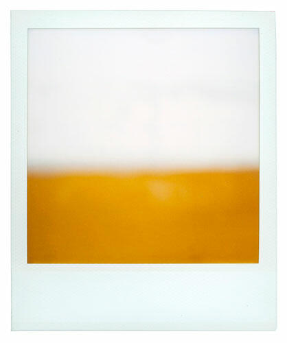 2003-2005. Polaroid, 3 1/2 x 4 1/4 in./ 9 x 11 cm.
Courtesy the artist/Cortesía del artista. -
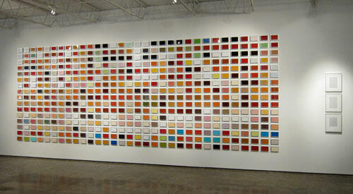 (from the series The Long Tail), 2008. C-prints, 512 framed photos, 4 x 6 in each; 3 texts, 11 7/8 x 23 1/5 in. each; installation 94 1/2 x 275 in. approx. Courtesy the artist and
Henrique Faría Fine Art, New York. 512 Drinks (de la serie The Long Tail), 2008. Fotografías color, 512 fotografías enmarcadas, 10,7 x 15 cm c/u; 3 textos, 30 x 60 cm c/u; instalación
240 x 270 cm aprox. Cortesía del artista y Henrique Faría Fine Art, Nueva York. -
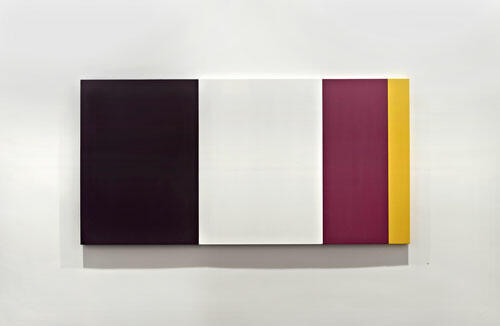 (from the series Logo Paintings), 2010. Acrylic on canvas, 39 3/8 x 78 3/4 in. Courtesy the artist and Henrique Faría Fine Art, New York.
Taco Bell (de la serie Logo Paintings), 2010. Acrílico sobre tela, 100 x 199 cm. Cortesía del artista y Henrique Faría Fine Art, Nueva York. -
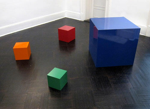 Formica and plywood, dimensions variable. Courtesy the artist and Henrique Faria Fine Art, New York. Fórmica y madera contrachapada, dimensiones
variables. Cortesía del artista y Henrique Faría Fine Art, Nueva York. -
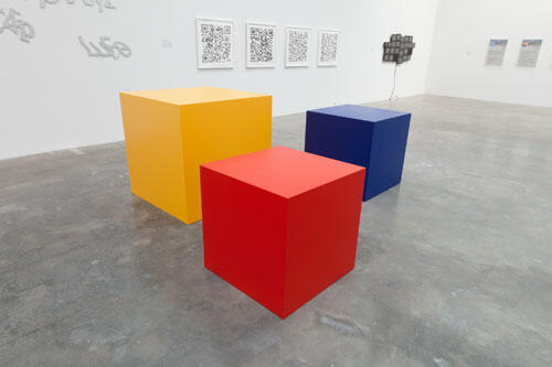 Formica and plywood, dimensions variable. Courtesy the artist and Pace/MacGill Gallery, New York. Democrats, Republicans, Tea Party, 2011. Fórmica y madera contrachapada, dimensiones variables. Cortesía del artista y Galería Pace/MacGill, Nueva York.
 -
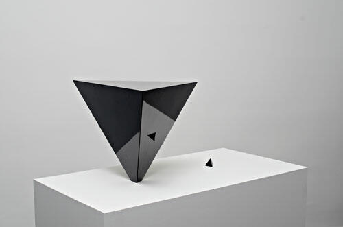 Formica and plywood, 48 x 17 x 17 in. Courtesy the artist and Henrique Faria Fine Art, New York. Imbalance, 2011. Fórmica y madera contrachapada, 122 x 43,2 x 43,2 cm.
Cortesía del artista y Henrique Faría Fine Art, Nueva York. -
 Courtesy the artist and Henrique Faria Fine Art, New York. Cortesía del artista y Henrique Faría Fine Art, Nueva York.


